Наши контакты:
- Адрес:г. Винница, Пирогова 39 (ТЦ Анастасия - 2-й этаж)
- Адрес:г. Киев, Краснозвездный просп., 99
- (Карта проезда)
- Телефоны:
- Винница: (096) 662-27-41
- Киев: (097) 756-40-75
- Почта: info@abcname.net
- Skype:abcname.company
- Facebook:www.fb.com/ABCname
- YouTube:www.youtube.com/user/abcnamecompany
09666-22-741Не звоните ночью, уважаемые!


- Скрипты
- Jquery tooltip
- Tooltipster's
Tooltipster's
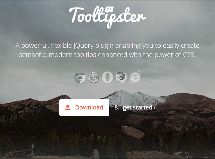
Tooltipster представляет собой легкий и простой в стиле JQuery плагин, который поможет вам легко создавать всплывающие подсказки. Стиль вашей Tooltipsters-подсказки может быть легко изменен спомощью специально приготовленых тем. У вас также есть возможность создать и прикрепить новую тему.
Tooltipster дает Вам широкий спектр переменных чтобы настроить вашу подсказку к содержимому вашего сайта.
- $('.tooltip').tooltipster({
- animation: 'fade',
- arrow: true,
- arrowColor: '',
- content: '',
- delay: 200,
- fixedWidth: 0,
- maxWidth: 0,
- functionBefore: function(origin, continueTooltip) {
- continueTooltip();
- },
- functionReady: function(origin, tooltip) {},
- functionAfter: function(origin) {},
- icon: '(?)',
- iconDesktop: false,
- iconTouch: false,
- iconTheme: '.tooltipster-icon',
- interactive: false,
- interactiveTolerance: 350,
- offsetX: 0,
- offsetY: 0,
- onlyOne: true,
- position: 'top',
- speed: 350,
- timer: 0,
- theme: '.tooltipster-default',
- touchDevices: true,
- trigger: 'hover',
- updateAnimation: true
- });
Options
animation | fade, grow, swing, slide, fall | Determines how the tooltip will animate in and out. Feel free to modify or create custom transitions in the tooltipster.css file. In IE9 and 8, all animations default to a JavaScript generated, fade animation. Default: 'fade' |
arrow | boolean | Adds the "speech bubble arrow" to the tooltip. Default: true |
arrowColor | hex code / rgb | Select a specific color for the "speech bubble arrow". Default: will inherit the tooltip's background color |
content | string | If set, this will override the content of the tooltip. Default: '' |
delay | integer | Delay how long it takes (in milliseconds) for the tooltip to start animating in.Default: 200 |
fixedWidth | integer | Set a fixed width for the tooltip. The tooltip will always be a consistent width - no matter your content size. Default: 0 (auto width) |
maxWidth | integer | Set a max width for the tooltip. If the tooltip ends up being smaller than the set max width, the tooltip's width will be set automatically. Default: 0 (no max width) |
functionBefore | function | Create a custom function to be fired before the tooltip launches. See theadvanced section to learn more. Default: function(origin, continueTooltip) { continueTooltip(); } |
functionReady | function | Create a custom function to be fired when the tooltip and its contents have been added to the DOM. Default: function(origin, tooltip) {} |
functionAfter | function | Create a custom function to be fired once the tooltip has been closed and removed from the DOM. Default: function(origin) {} |
icon | string | If using the iconDesktop or iconTouch options, this sets the content for your icon. Default: '(?)' |
iconTheme | CSS class | If using the iconDesktop or iconTouch options, this sets the class on the icon (used to style the icon). Default: '.tooltipster-icon' |
iconDesktop | boolean | Generate an icon next to your content that is responsible for activating the tooltip on non-touch devices. Default: false |
iconTouch | boolean | Generate an icon next to your content that is responsible for activating the tooltip on touch devices (tablets, phones, etc). Default: false |
interactive | boolean | Create a delay that allows users to interact with the tooltip. The tooltip will close after the user hovers off the tooltip or taps off of it. Default: false |
interactiveTolerance | boolean | If the tooltip is interactive and activated by a hover event, set the amount of time (milliseconds) allowed for a user to hover off of the tooltip activator (origin) on to the tooltip itself - keeping the tooltip from closing. Default: 350 |
offsetX | integer | Offsets the tooltip (in pixels) farther left/right from the origin. Default: 0 |
offsetY | integer | Offsets the tooltip (in pixels) farther up/down from the origin. Default: 0 |
onlyOne | boolean | If true, only one tooltip will be allowed to be active at a time. Default: true |
position | right, left, top, top-right, top-left, bottom, bottom-right, bottom-left | Set the position of the tooltip. Default: 'top' |
speed | integer | Set the speed of the animation. Default: 350 |
timer | integer | How long the tooltip should be allowed to live before closing. Default: 0 (disabled) |
theme | CSS class | Set the theme used for your tooltip. Default: '.tooltipster-default' |
touchDevices | boolean | If true, Tooltipster will run on touch devices (tablets, phones, etc). Default: true |
trigger | hover, click, custom | Set how tooltips should be activated and closed. See the advanced section to learn how to build custom triggers. Default: 'hover' |
updateAnimation | boolean | If a tooltip is open while its content is updated, play a subtle animation when the content changes. Default: true |